Today I’m so excited to be sharing a personal project! With baby #2 due any day now (well, TODAY actually), I finally realized I needed to get serious about designing a space for our 3-year-old, Jack. He still sleeps pretty happily in his crib, but we’re evicting him so we can have access to the changing table, rocker and all of the other baby nursery creature comforts that are in his current room.
His new room (aka our old office *cry*) used to be an incredibly awkward guest room / den / office when we purchased our home last year. It had a large angled wall with double doors opening up to the foyer/living area. Not only do I have a strong distaste for angled walls, but functionally it didn’t work.
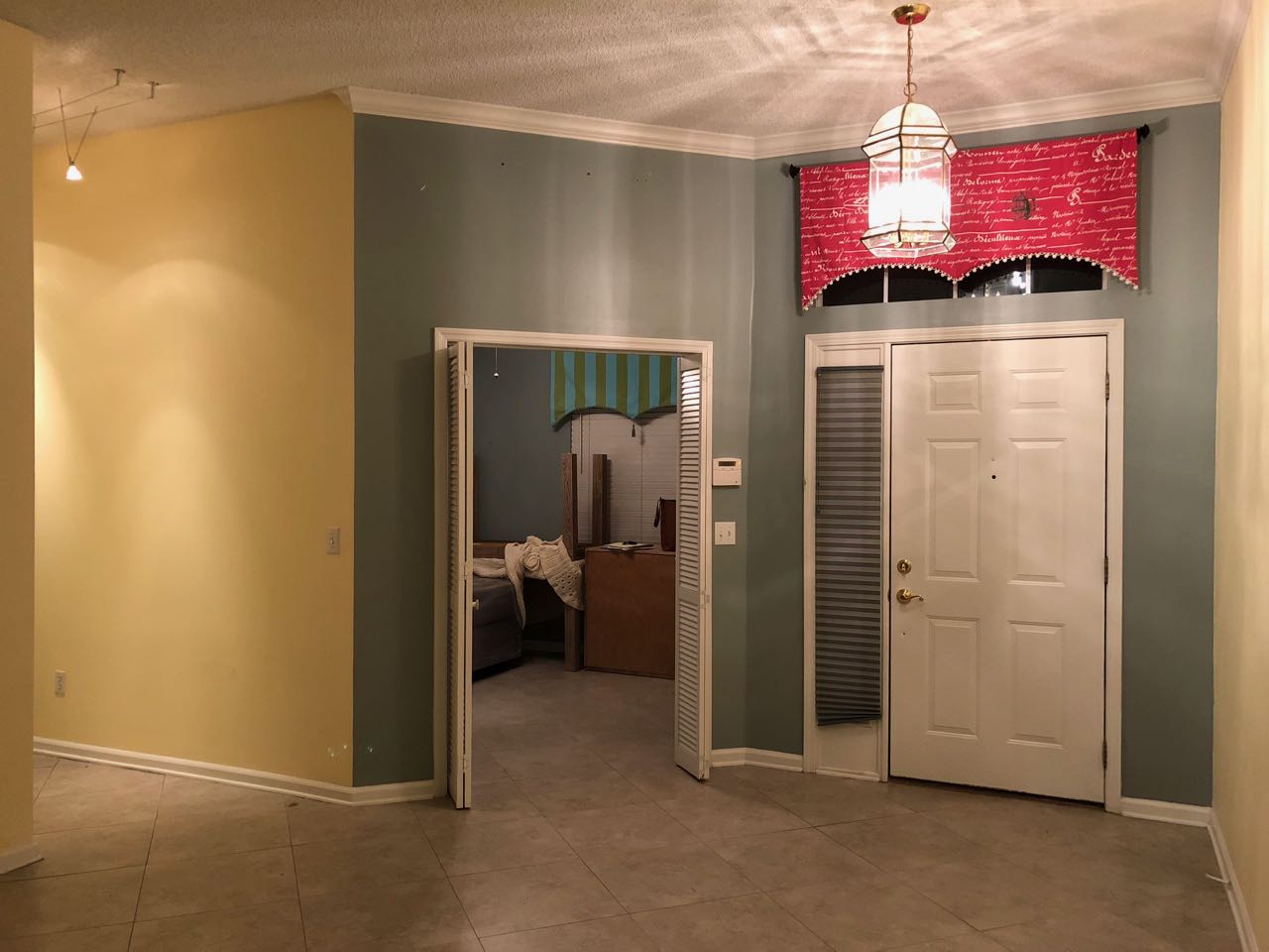
First off, the angle made for a VERY SMALL amount of usable square footage within the room, in fact, the previous owners removed the bed they had in there (for real estate showings) so the lack of space wouldn’t be so conspicuous! Secondly, what guest or occupant wants to exit their bedroom in such a high profile location? Good luck walking down the hallway to the bathroom with any kind of privacy whatsoever.
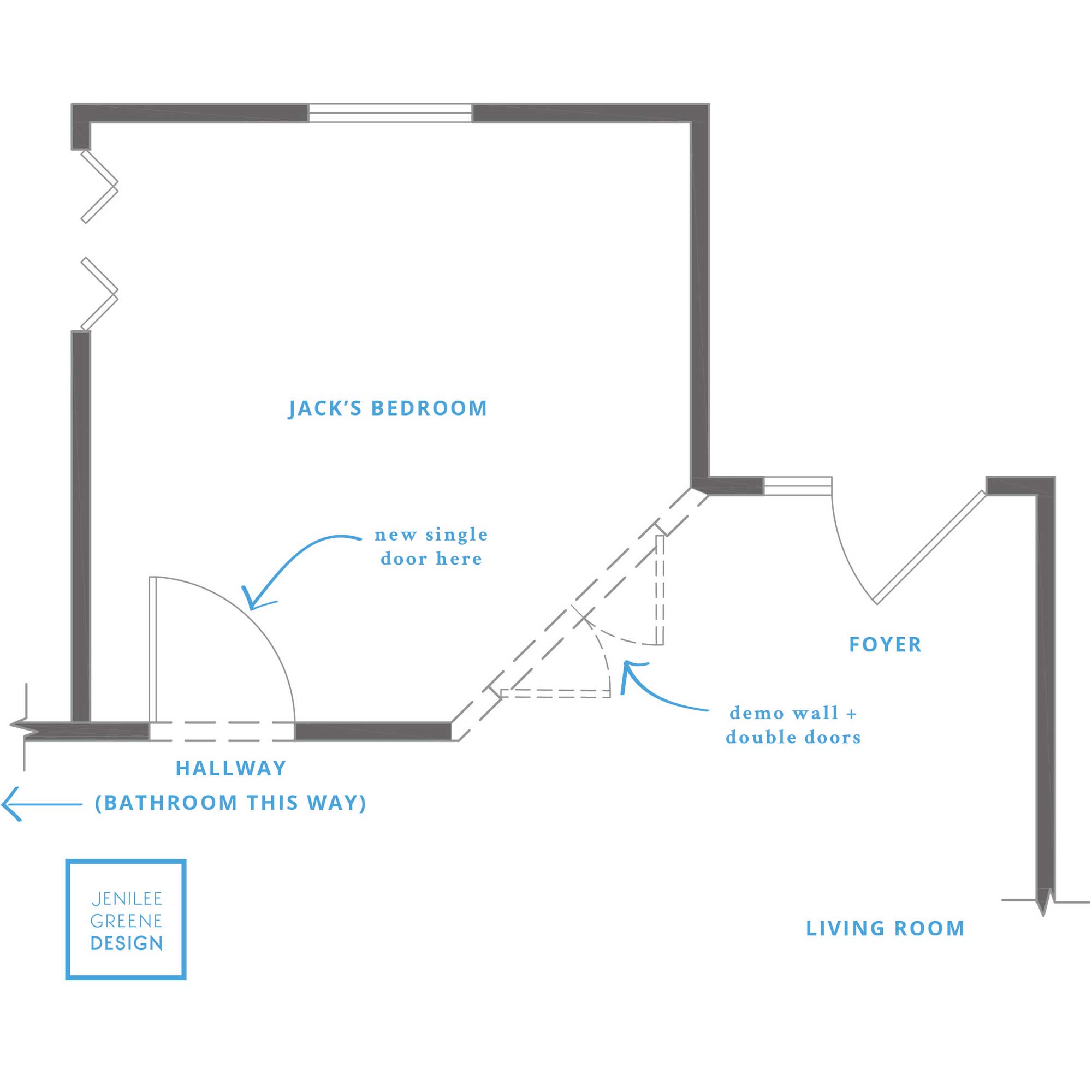
This problem was easily solved by squaring off the wall and relocating the door before we moved in and I’m SO glad we did. This is exactly the kind of minor, but thoughtful tweak that can add value to your home and your LIFE (no, that’s not an exaggeration). The other bonus (besides gaining usable space and privacy) was the new wall configuration established a proper foyer. The only thing that bothers me more than an angled wall is walking straight into a living room from the outside! Needless to say, I was very excited to have even a small amount of transition space.
Anyway, moving onto the design plan! Designing kids’ rooms is always such a fun challenge. Crate & Kids, Pottery Barn Kids, RH Baby & Child, etc. make it very easy to select some attractive pieces that aren’t horribly ugly when designing a kids room, however things can get really theme-y and really matchy matchy quickly. There’s nothing wrong with that, but to me it lacks the depth of personalization and character that makes for a really dynamic layered room. I’d also rather not have a room in my house that is super childish, because everyone will lose interest pretty quickly—kids characters and themes are just not very timeless… and I’ll just say it– I don’t want it!! There are other things we can get him excited about (and luckily he doesn’t really watch any TV or care about any characters at this point).
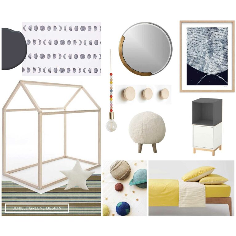
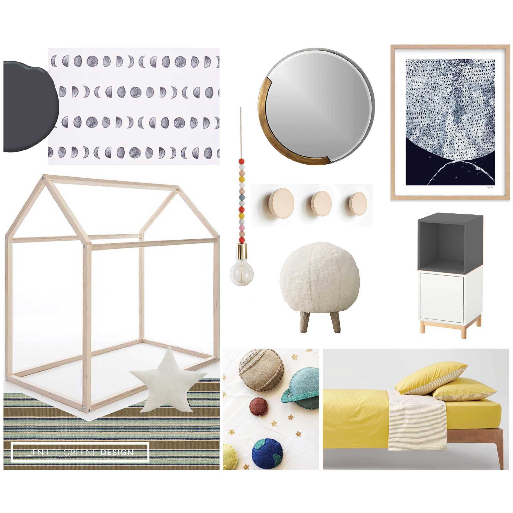
The goal here was to create a cozy, comfortable, functional room that is whimsical and childlike, but still sophisticated and blends with the rest of the style in our home. Oh yeah, and lots of space for play and SO MUCH STORAGE / TOY STORAGE. Easy right? Here’s where I landed with the final style board.
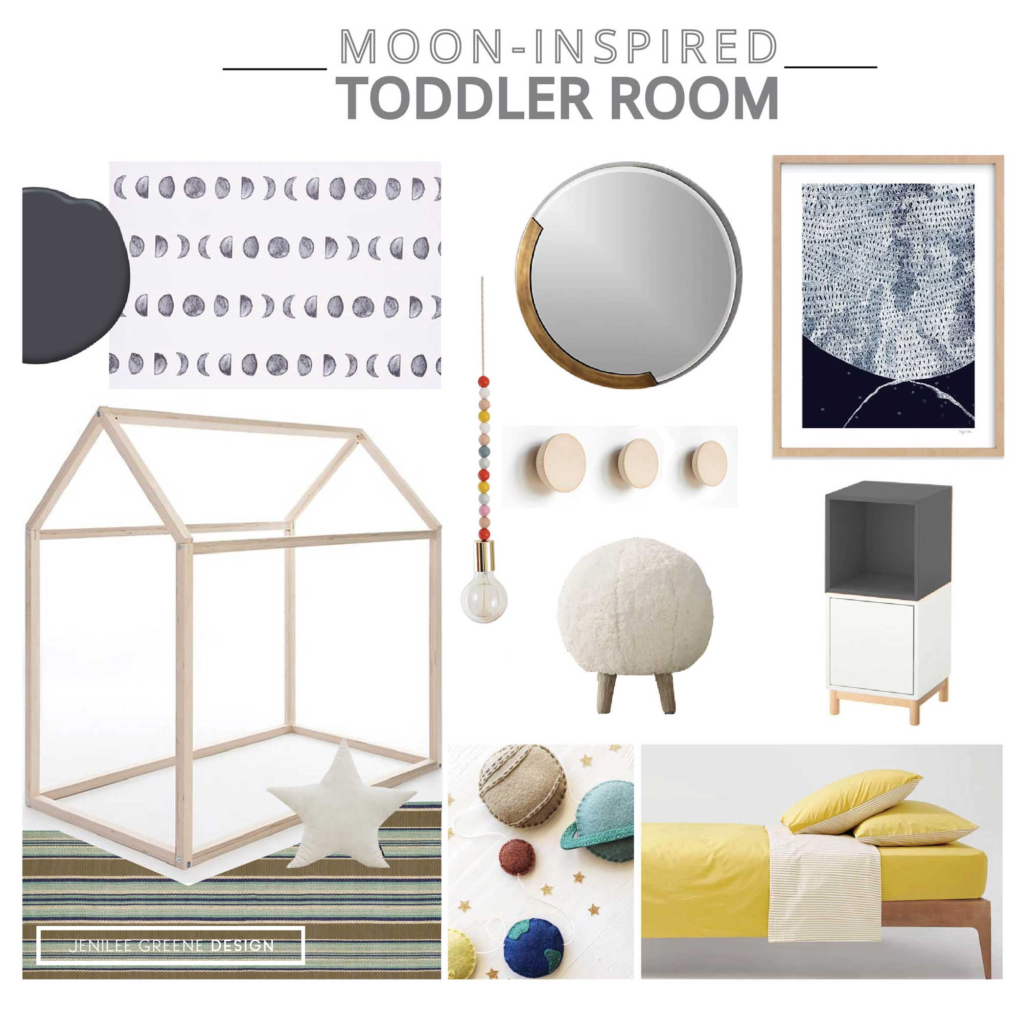
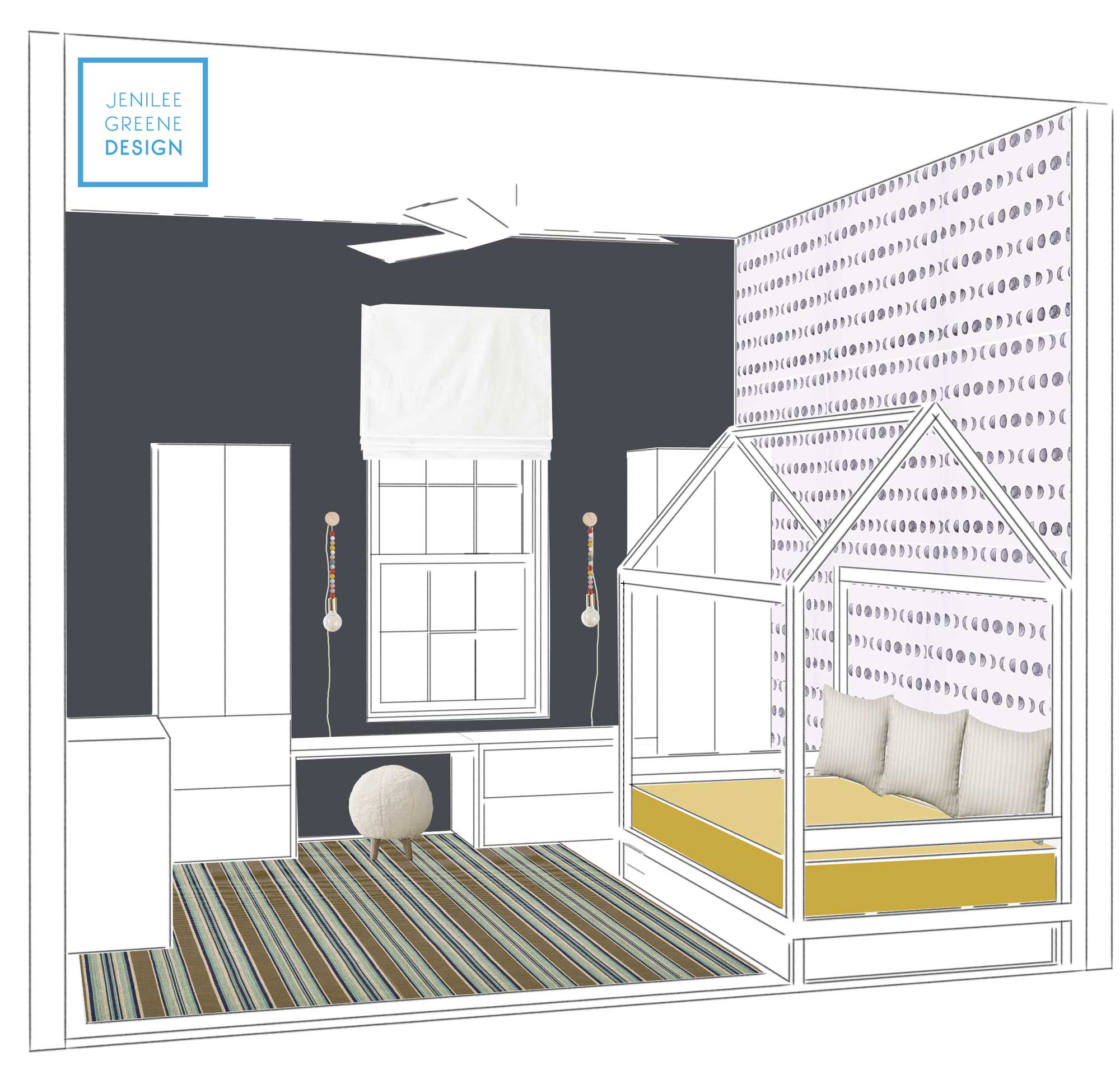
Some people look at me like I’m crazy when I say I’m painting my child’s room “black”. To that, I have to say “sorry, not sorry”. I like how the black provides contrast, ties in with the moon phases pattern going on the adjacent wall AND hints at a “space theme” without being too on the nose. Since there are 8 million shades of black, I selected one (Benjamin Moore Nightfall) that is really more of a very dark grey (when compared to black black) and has a slight blue undertone so it will pair well with the existing rug which has navy blue stripes running through it.
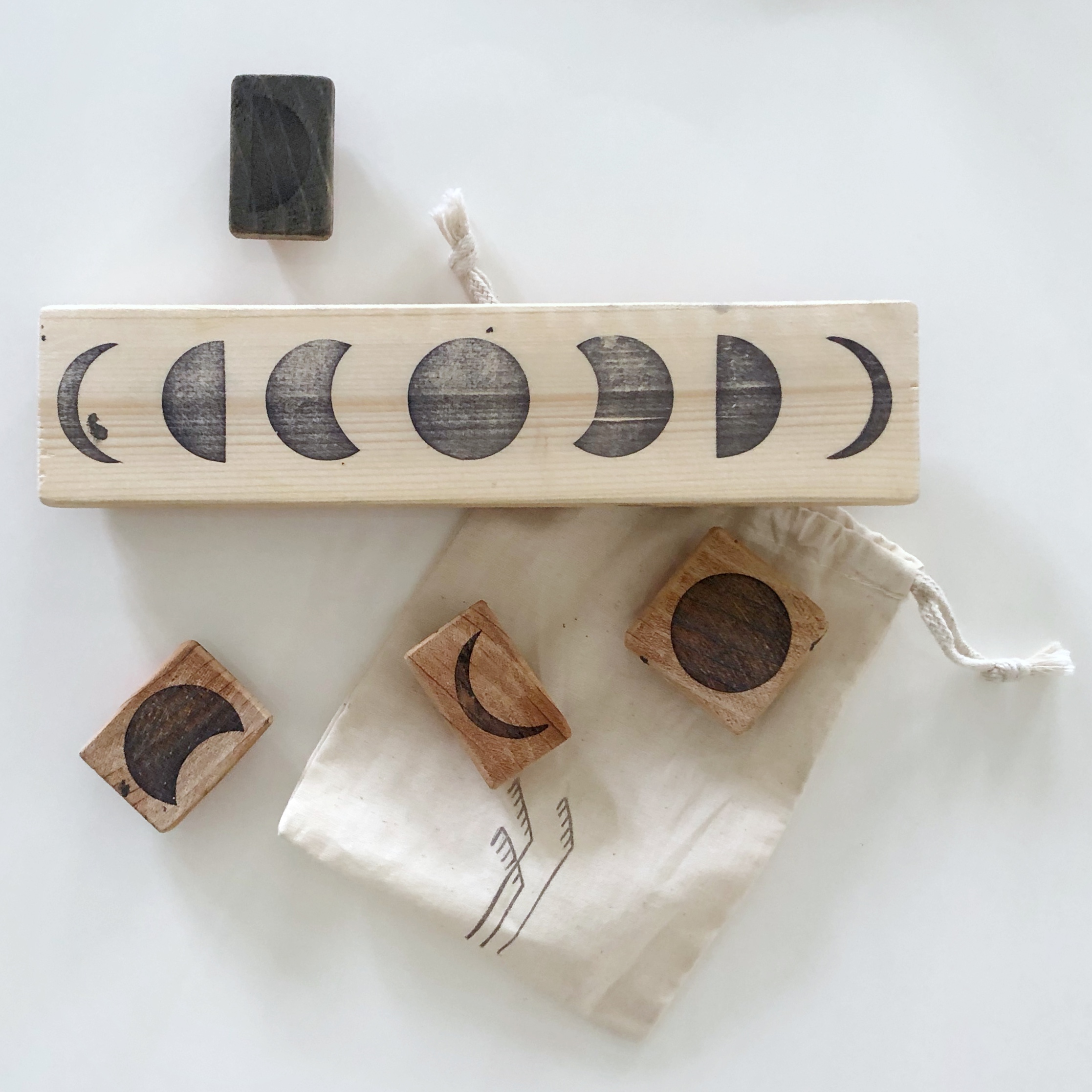
I’ve been eyeing this moon wallpaper for some time. The overall pattern is so cool and Jack has been obsessed with the moon since day 1. I’m not totally confident with the idea of installing any kind of wallpaper (removable or otherwise) myself, so I’m attempting a DIY with customized rubber stamps that I’ve ordered. (Update, this worked but was extremely tedious and time consuming and I wish I hadn’t gone this route, LOL. Now I know why THIS IS NOT REALLY A THING PEOPLE DO—more later).
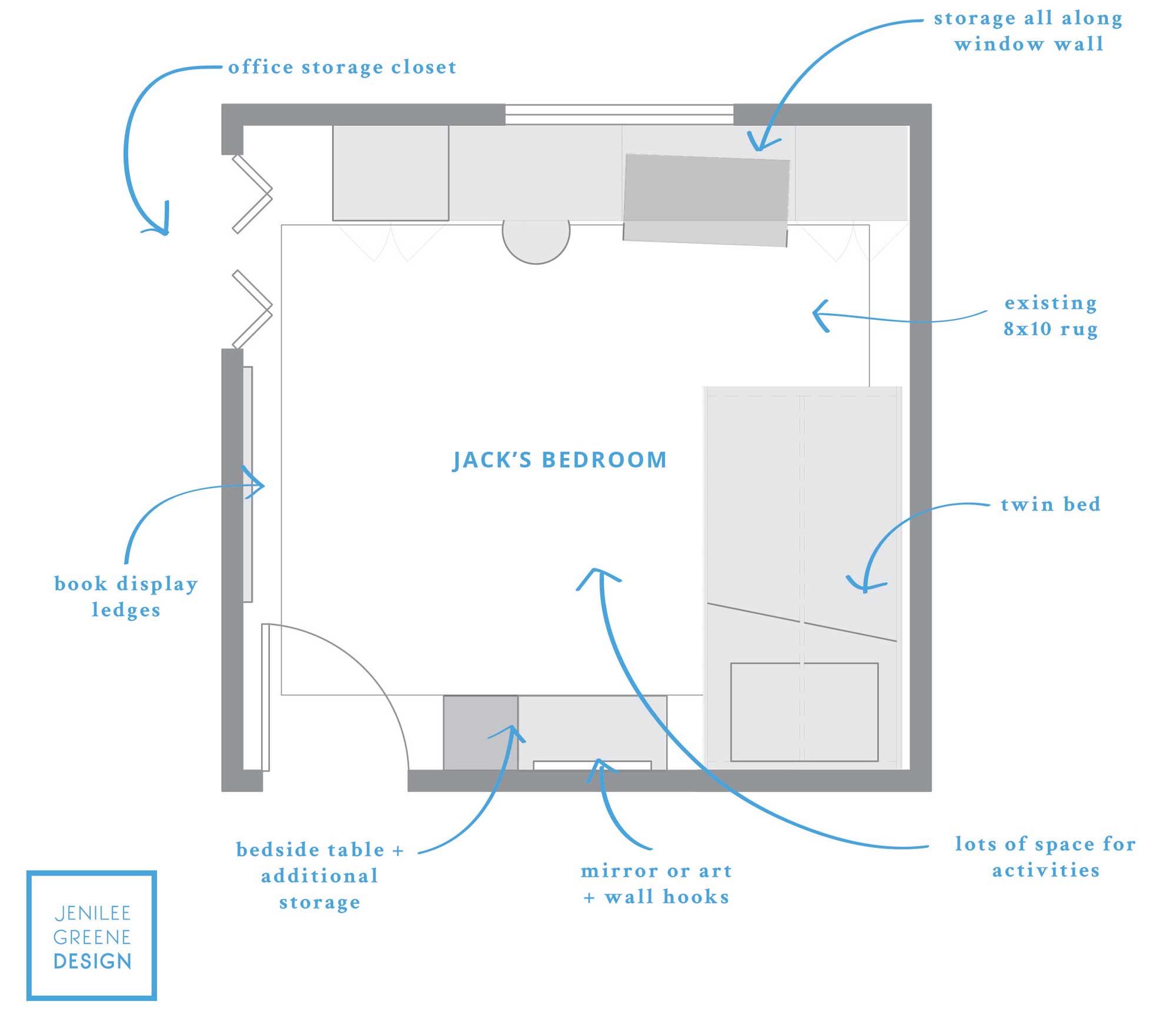
I knew I wanted a Montessori inspired house bed because why have a regular bed when you can have a HOUSE bed?! I also knew this would help sell the new room and new bed to Jack. What does a house have to do with moons or the solar system or space? Nothing, doesn’t need to. We didn’t like the idea of having the mattress directly on the ground, so we requested a customized version to lift it and allow for a trundle or underbed storage option in the future. I also requested head and footrails to keep everything better contained on the bed. Working with fabricators on Etsy is always so great because they are more than willing to customize!
We are going with strictly IKEA solutions for the storage. Sadly, Jack’s closet will not be his closet, it will stay our closet to hold office items. That in mind, I wanted to maximize wall storage within the room and create the look of custom built-ins, so I was able to squeeze in 4 IKEA STUVA pieces to create storage and functionality with only 1” to spare, clearing the closet doors. I tested various other “built-in” options including the PAX and BESTA systems. STUVA ended up being the most cost effective and the dimensions couldn’t have worked out better!
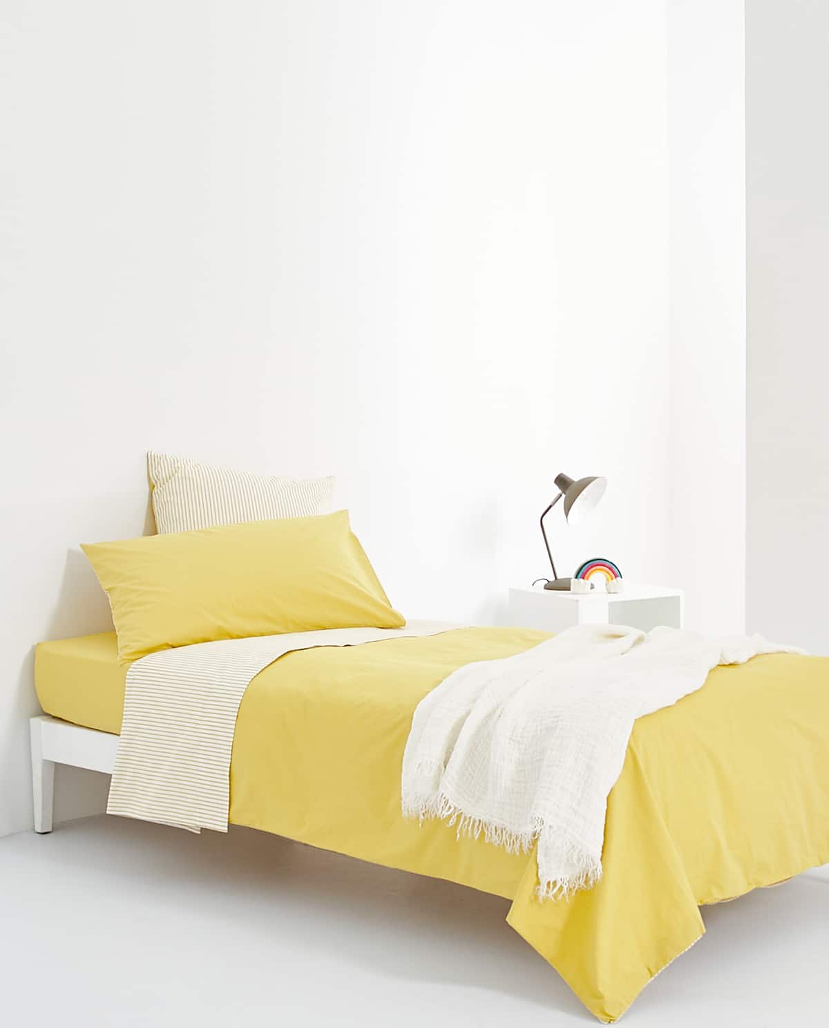
I instantly fell in love with this bedding from Zara Home. It looks pretty basic, but the color is so good (better in person) and I love that it reverses to stripes to add depth and pattern to the overall bed look. This bedding is so much more timeless than Sesame Street.
I prepared a 3D rendering to play around with the placement of wallpaper, wall colors, and just generally to understand the storage and how it will look with our 10 ft. ceilings. They have a shorter version of the STUVA wardrobes / shelving units, but the proportions wouldn’t have been great with the high ceilings. I can’t even begin to express my love for using 3D and Photoshop as a tool to test things visually.
There you have it! Stay tuned for other updates on Instagram and the final reveal coming soon.
Shop the look:
Paint by Benjamin Moore // Wallpaper by Chasing Paper // Mirror by CB2 // Artwork by Minted // Bed (custom) by Etsy // Pendant light DIY via A New Bloom // Round wall pegs by Etsy // Star pillow by Etsy // Stool by Restoration Hardware // Rug by Dash & Albert // Bedding by Zara Home // Storage pieces by IKEA (STUVA + EKET)